[UPDATED: Sept. 28, 2020 – 8:00am EST]
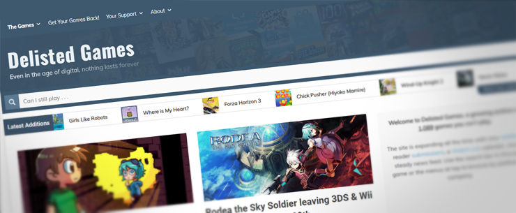
And we’re up!! The transition to the new theme went well and just about everything is in place. I’ll have a video up this week detailing the new layout and features but here’s a quick primer if anyone is feeling lost compared to the old theme:
- The page menus and social links have moved to the very top of the page. The color theme has been cleaned up but all pages are just like they used to be.
- The search bar has been refined. Results are now tagged with the platforms they are delisted on and if you use the Options button to toggle on the ‘News’ category you’ll see these posts more clearly defined.
- If you’re interested in quickly seeing the latest games added to the site, click the “More new additions” link below the scrolling ticker to jump down the home page. All the major players are represented in one quick glance!
- Most pages have new sidebars to quickly show you the latest additions or headlines. On mobile these will be towards the bottom of the page.
- Speaking of mobile, the layout should be much improved over the old theme. The table of release dates and relevant links is more readable and I tweaked the theme to give everything more space on smaller screens.
Please do leave me some comments with your thoughts on the design, especially if something looks broken on your screen. Hopefully I can fix any wily issues that pop up.
Thanks for taking a look, you can leave the housewarming gifts over on the site’s Ko-fi page. ☕👍
Original Post from Sept 27 follows:
I realize there isn’t a ton of time left to gird yourselves before it happens but the Delisted Games makeover will be going live Monday morning (as in tomorrow, at the time I’m writing this). I’ve been building and testing and tweaking for a little over a week now and I’m happier than I ever expected with the results! That is, until I make the switch.
I’m pretty certain that at least a few of the customizations I’ve made in testing on my local machine aren’t going to sync up 100% on the live server. Be prepared to see some funky stuff if you’re on the site around 6am EST Monday morning. I was hoping to make the change early Sunday morning but the proverbial paint was still drying.
By all means, drop a comment with your thoughts when you see it. I feel pretty confident about the layout and flow but if something looks broken on your screen, let me know. I’ve only been able to test things on a few different devices.
Thanks for sticking with me through any unexpected explosions, implosions, or meltdowns.
